
Label Tasting
TWO CENTS | DEC 21, 2021
Label Tasting
You can’t judge a book by its cover... or can you?
On my way to a dinner party recently, I had to grab a bottle of wine in a pinch. I knew my hostess’s general taste: natural, white/orange, often funky, often bubbly. But the wine shop on my route was a fairly run-of-the-mill shop doing a roaring trade in big Cali reds, mommy-friendly whites, and plenty of Prosecco and Aperol.
So to quickly home in on the winning bottle, I employed a time-tested shortcut: judging a book by its cover. Today’s low-intervention wines mark themselves out to a discerning millennial audience with minimalist, abstractly artful labels low in text and high in color (preferably pastels).
In my years both as a wine consumer and a wine seller, I often hear friends and customers sheepishly admit that they make wine choices largely on the basis of a pretty label. What they—as well as snooty wine purists—might not consciously realize, is that you learn a surprising amount about what’s inside a bottle just by looking at its getup.
As Jonathan Yadegar, a winemaker in California told me, “a label is the first touchpoint through which a customer interacts with your wine.” First impressions matter. Taste matters more, of course, but for relatively new entrants like Yadegar’s Jumbo Wines, a unique brand is a way to introduce yourself to the scene. We’re visual animals, and despite winemakers’ best attempts to be known for what’s inside, they are, at first at least, beholden to our antic 21st century eyeballs.
Some ancient winegrowing regions developed a uniform look to their labels over the years. You can instantly spot a Bordeaux by its faint sketches of the region’s trademark chateaux, or a Burgundy or top-shelf Rhône by their bold and brooding gothic script. And Old World labels can be so confoundingly text-heavy that wine education site Wine Folly devised a 1,000-word blog post to interpret them.
Even in their relative youth, the Cabs of Napa Valley seem to have coalesced around a serious look full of blacks and silvers—some modernist, others more traditional—that seems to suggest “just because we’re new doesn’t mean we’re unsophisticated.” New World Chardonnays love bronzes, yellows and pastoral scenes evocative of oak, butter and the good life.
If you’ve ever been to a tasting at a small mom & pop winery, you might notice the labels are almost memorably unmemorable, like the label was an afterthought, or the work of a Gen Z nephew with some rudimentary Adobe handiwork. I recently picked out a Finger Lakes red featuring an anthropomorphic lion so cheeky as to be almost ironically chic.
Today’s low-intervention producers have taken bottle branding to a whole new level. The replacement of word clusters with loud, eye-grabbing graphics may be a visual outgrowth of this new guard’s rejection of stodgy agricultural and winemaking techniques. They’re young wines made for a young crowd unconcerned with appellations, vintages and crus. Sketches, photographs, and bright colors reign supreme.
“The cartoonier the better,” Francisco Arredondo, a New York City wine distributor, told me. “If you have a kid draw it you’re gonna sell pallets.” But if you find yourself in a shop focusing on the new and different, you might find all the trendy labels jarringly similar, and pining for some information about the region or grape (not to mention the difficulty apps like Vivino have recognizing minimalist labels).
More and more, producers are employing textured labels and quirky packaging to stand out in an increasingly crowded visual marketplace. Crown caps on a bottle of bubbly and even the absence of foil can signal a bottle’s hipster credentials. Danielle Adams, a Los Angeles wine and food photographer and self-professed natty wine lover, looks out for clear-glass bottles, the better to see cloudy juice and sediment. And that funky pet-nat lacking artificial preservatives should probably be downed ASAP; traditional producers favor green and brown glass to protect against UV damage during transit and bottle-aging.
Most everyone I spoke to on the subject agreed that a label certainly doesn’t make a wine, but it can make a good wine more special, and certainly more memorable. Jeff Bauer, a colleague at the Upper East Side shop where I work, said packaging gimmicks can help customers recall wines from producers with difficult-to-pronounce or forgettable names. “Customers will come in asking for the bottle with the stick on it or the bottle with all the wax on top,” Bauer said, referring, respectively, to Cantina Zaccagnini’s popular Montepulciano d’Abruzzo, and Belle Glos’s high-end Cali pinot.
And any discourse on art and marketing would be remiss to overlook the role of sex. But the drinks industry is constrained in that department thanks to good old-fashioned government prudishness. According to Title 27 Section 4.39 of the Federal Code of Regulations, wine labels cannot feature “any statement, design, device, or representation which is obscene or indecent.” Of course what is considered obscene or indecent is entirely subjective, and some legal pundits have debated whether certain Supreme Court decisions defending free speech from onerous government restrictions might apply here. Regardless, most producers have decided not to test the notoriously strong-headed Alcohol and Tobacco Tax and Trade Bureau. Though some have come close.
Even more provocatively, in 2017, a new white-owned bar in a historically Black part of Brooklyn got itself in hot water for highlighting the neighborhood’s violent reputation with Instagram posts featuring Forty Ounce Wines’ cheeky malt-beverage-esque bottle against what are ostensibly bullet holes in the wall behind the bar. Even The Prisoner, arguably the world’s best-known and most coveted wine, has not escaped controversy for a brand that some find to fetishize suffering.
Of course all consumer-facing industries rely on memorable visuals to market their products. What is Coca Cola without its curvy bottle or Nike its immortal swoosh? But at the end of the day, wine is an agricultural product, and it came late to the 20th century’s branding frenzy. There are likely millions of unique wines produced worldwide every year, compared to around 40,000 unique products in your average grocery store. And the vast majority of wineries are not looking to stand out on a global stage; many probably just want to have a little fun when they’re not busy planting, picking and crushing.
Maybe that’s why wine and art share such a long intertwined history. Wine-tasting in Napa Valley increasingly includes the bonus opportunity to admire blue-chip art. The Hess Collection Winery alone shows Robert Rauschenberg, Nick Cave and Francis Bacon in an on-site museum. Champagne juggernauts Dom Perignon and Veuve Clicquot have commissioned packaging collaborations with the artists Jeff Koons and Yayoi Kusama, respectively. Just last month, Ruinart, another storied Champagne house enlisted British artist David Shrigley for a whimsical collaboration that was unveiled at–you guessed–Art Basel Miami Beach. (To me, these projects carry whiffs of multi-million-dollar marketing budgets more than anything distinctive about the wines.)
Toward the more modest end of the spectrum, wineries like Las Jaras Wines in California, Gut Oggau in Austria and Swick Wines of Oregon have begun to spotlight their artist collaborators prominently on their websites, sometimes featuring interviews, bios and links to their personal art pages. Cerise Zelenetz, one of the artists who has contributed to Swick’s bottles, landed the gig after posting an admiring shot on Instagram of a funny Swick label she discovered in her local wine bar. No surprise then that Zelenetz considers winemakers “artists who express themselves through a different medium than me.”
Instagram is also how Phoebe Tillem was tapped for Winc’s Cherries & Rainbows red blend. “Playful, funky, colorful,” is the direction the Los Angeles illustrator was given by the wine club’s co-founder Brian Smith, a friend of a friend (descriptors that succinctly–and mouthwateringly–paint the wine itself). It’s a label that exemplifies but also complicates the new age of winemaking and labeling. The name is nowhere to be found except symbolically, and in a mix of French and English, text on the front screams its low-intervention cred: organic, no sulfites, and made outside of France’s strict appellation-specific regulations.
Might a cynic suspect some middling wineries of hiding behind an appealing front? And just like the terms “natural” and “sustainable” don’t have legally binding definitions in most jurisdictions, unscrupulous producers may resort to visual tricks to wink at a certain demographic. “More traditional, conventional wines who are trying to appeal to a younger crowd might try to slap an "artsy" label on their bottle, but that doesn't necessarily mean they're practicing low-intervention, quality winemaking,” Adams, the photographer, suspects. But, “a pretty label sure doesn't hurt the prospects of catching the eye (and purchase) of the natural-leaning young crowd.”
In another, higher-tech but cheesier attempt to catch the attention of the White Claw generation, an app called Living Wine Labels lets consumers scan a label for an augmented reality experience. Imbibers of 19 Crimes get to learn the stories behind the 19th century criminals banished to the Australian penal colony whose mugshots adorn the producer’s bottles.
Few are as equipped to expound on the subject as Zelenetz, who has not only designed wine labels but who opened a wine bar herself in Bushwick this summer. “Wine is all about storytelling and the best labels are supportive book covers,” Zelenetz told me. “It's almost as if a surprise dinner guest showed up when you order a bottle to the table. It has that same power of an unexpected guest, to make or break the drinking experience.” (All the more so since restaurant wine lists offer very little information to inform your decision besides a wine’s name and provenance.)
But she’s hardly the only artist to dip a toe in the service industry. Like countless artists starting out, Jeremy Haines supported himself for years as a bartender and server, an experience at times so silly and #relatable he’s devoted a long-running comic strip to the world. Wine can be so steeped in jargon and exclusivity, hospitality is one of the few introductions young people get to it. Haines was a full-blown oenophile by the time a friend asked him to create the label for a Finger Lakes Riesling, Jewels & Binoculars (itself named for an obscure Bob Dylan lyric). Wine imitates art, you know the rest.
In the wine store where I work, I find myself—consciously or unconsciously—falling back on visual cues on bottles to make quick judgments for customers deciding between two bottles I’m not too familiar with. Cute bear drawing? That one’s fun and sprightly! Imposing old chateau? Serious and oaky. I don’t consider this lying exactly. Like Zelenetz said, selling wine is about telling a story. I’m no behavioral psychologist, but I know wine drinkers will enjoy a bottle much more if they have a positive preconception around it, whether delivered by a working artist, a marketing honcho or the schmuck at your local wine shop.
-
Alexander McQuilkin is a full-time bureaucrat in New York City’s housing agency, and a part-time writer and wino.
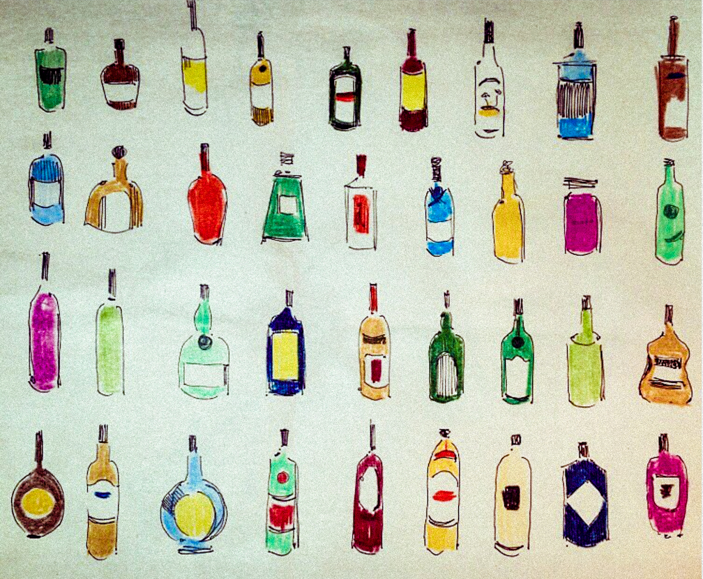
Image provided by artist Andie Dinkin.
SIMILAR ARTICLES


